 When I first found out that J.R.R. Tolkien’s translation of Beowulf was finally going to be published, I immediately wondered what the cover would look like. Would there be artwork? Original or maybe one by the Professor? What color would it be? Would it fit in well with the other books in my collection?
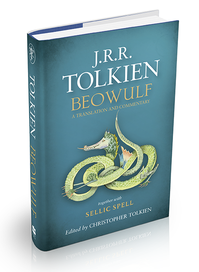
Well, when I saw the cover I was very pleasantly surprised! I love seeing one of Tolkien’s illustrations featured, and the darkened edges are just right, creating a subtle sense of depth. In this Tumblr post, HaperCollins designer, Ben Gardiner, gives insight into how the cover was created.
It was his goal to keep the Tolkien name recognizable by using the classic Sabon Roman font, while giving Beowulf a Viking-esque feel with Jonathan Barnbrook’s Mason Serif typeface. To find out more about this beautiful design, make sure to read the original post.
“It’s a balancing act designing a cover to illustrate J.R.R. Tolkien’s literary texts; simultaneously giving his fantastical works a stand out and distinctive look, whilst also paying respect to the genre and decades of publishing that have gone before.”
You can follow Ben Gardiner on Twitter, and to see more of HarperCollins’ brilliant designs, make sure to follow them on Tumblr and Twitter.