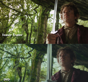
Color comparison of The Hobbit: An Unexpected Journey teaser trailer (top) and DVD. Photo from A Tolkienist’s Perspective.
Although we were in many ways in familiar territory when we first encountered The Hobbit: An Unexpected Journey in 2012, there were some striking differences between the look and feel of The Hobbit and that of The Lord of the Rings films. “The Colours of The Hobbit” on A Tolkienist’s Perspective recently took a close look at differences in the color palettes of The Hobbit films and The Lord of the Rings films, and uncovered some very interesting comparisons.
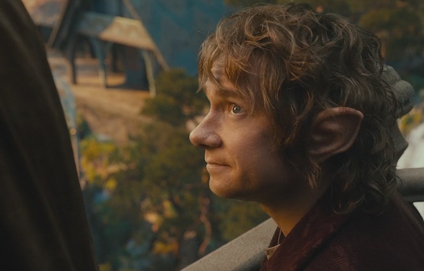
Bilbo converses with Lord Elrond in The Hobbit: An Unexpected Journey. Photo from A Tolkienist’s Perspective.
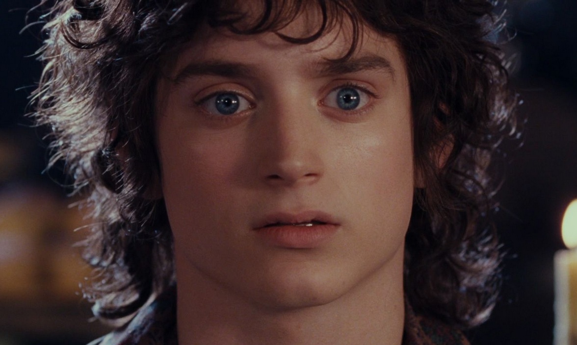
Frodo watches Bilbo vanish in The Lord of the Rings: The Fellowship of the Ring. Photo from A Tolkienist’s Perspective.
James, author of A Tolkienist’s Perspective, observes that the overall color scheme of The Hobbit is much brighter, vibrant, and saturated than that of The Lord of the Rings, speculating that the differences in color palettes may reflect the younger, less evil Middle-earth of The Hobbit’s time, and the fact that The Hobbit and The Lord of the Rings are different stories.
The article makes some very interesting comparisons between shots from the teaser trailer for The Hobbit: An Unexpected Journey and the film’s DVD. A Tolkienist’s Perspective points out that the reader needs to disregard differences in contrast between the image comparisons, given the different sources of the screen capture images and DVD/video players.
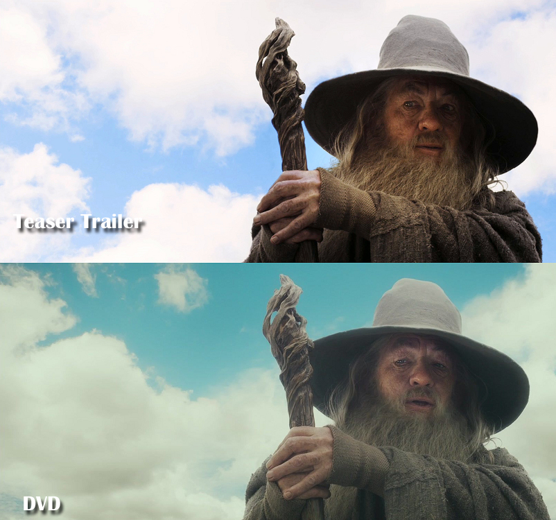
Color comparison of The Hobbit: An Unexpected Journey teaser trailer (top) and DVD. The sky behind Gandalf has been digitally replaced, and the frame has a cooler overall color. Photo from A Tolkienist’s Perspective.
The DVD images have a decidedly glossy, shiny effect, giving them a “surreal” feel. In the DVD frame of the shot of Gandalf, even the more realistic sky has been replaced, and the whole frame has a cooler, greenish cast. This sort of color scheme occurs throughout the film. Compare this look and feel to a very similar shot of Gandalf from The Lord of the Rings: The Fellowship of the Ring. Here, as in the teaser trailer for The Hobbit: An Unexpected Journey, the feeling is much harsher, in that it feels sharper and more realistic. The tone of The Hobbit is softer, glossy, glowing, more idealized.
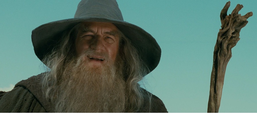
This shot of Gandalf in The Lord of the Rings: The Fellowship of the Ring closely resembles the color scheme in the image from the teaser trailer of The Hobbit, above. Photo from A Tolkienist’s Perspective.
Won’t this striking difference in color palettes make for a jarring transition when we have all three Hobbit films to set in front of The Lord of the Rings films? Perhaps not, suggests James, as the article on A Tolkienist’s Perspective turns to look at The Hobbit: The Desolation of Smaug. In this second Hobbit film, the colors remain strong, and the glossy style remains, but the colors are far less vibrant. The entire palette is less saturated than in the first Hobbit film. James speculates that The Hobbit: There and Back Again will continue that trend, leading the color palette directly into the color schemes of The Lord of the Rings.
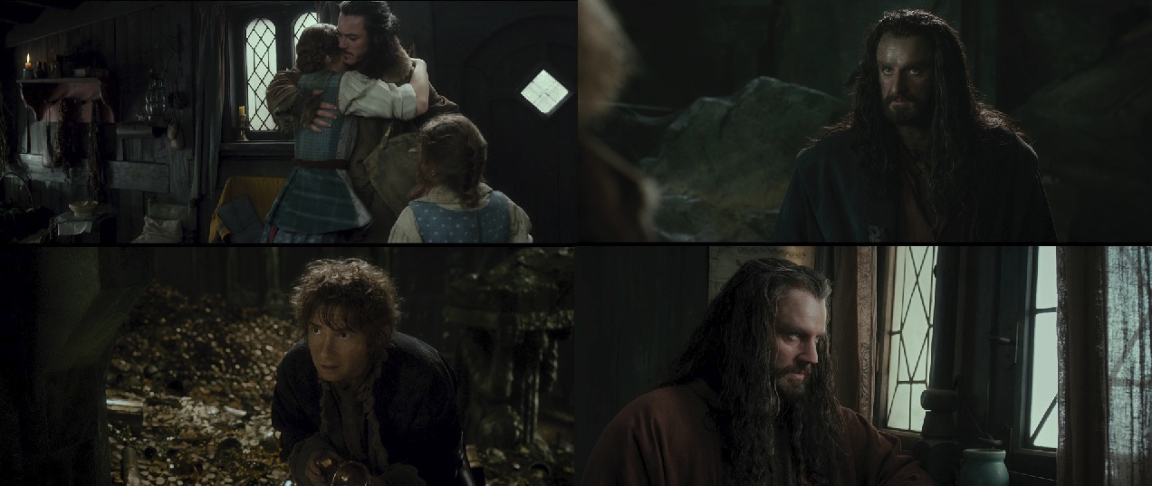
These frames from The Hobbit: The Desolation of Smaug show a less saturated color palette than in the first Hobbit film. Photo from A Tolkienist’s Perspective.
More example frames and in-depth discussion can be found in the complete article on A Tolkienist’s Perspective.


One Comment